Motion & effects
Entrance animations, transforms, filters, sticky elements, scroll and mouse effects.
On this page
Motion draws attention and makes a page feel alive: elements that fade in as they scroll into view, cards that lift on hover, a header that sticks to the top, images that drift with the scroll. All of this lives in the Behaviour tab of an element, in three sections: Animations, Motion & effects and Scroll & mouse effects.
Every effect respects visitors who prefer reduced motion (a setting in their operating system): for them, animations and scroll effects do not run and the element shows as styled.

Animations
Behaviour → Animations is the most flexible way to animate an element. Each animation has a trigger, one or more steps, and timing.
Add an animation
Open Animations
Select the element and open Behaviour → Animations. Click Add an animation.
Pick a preset
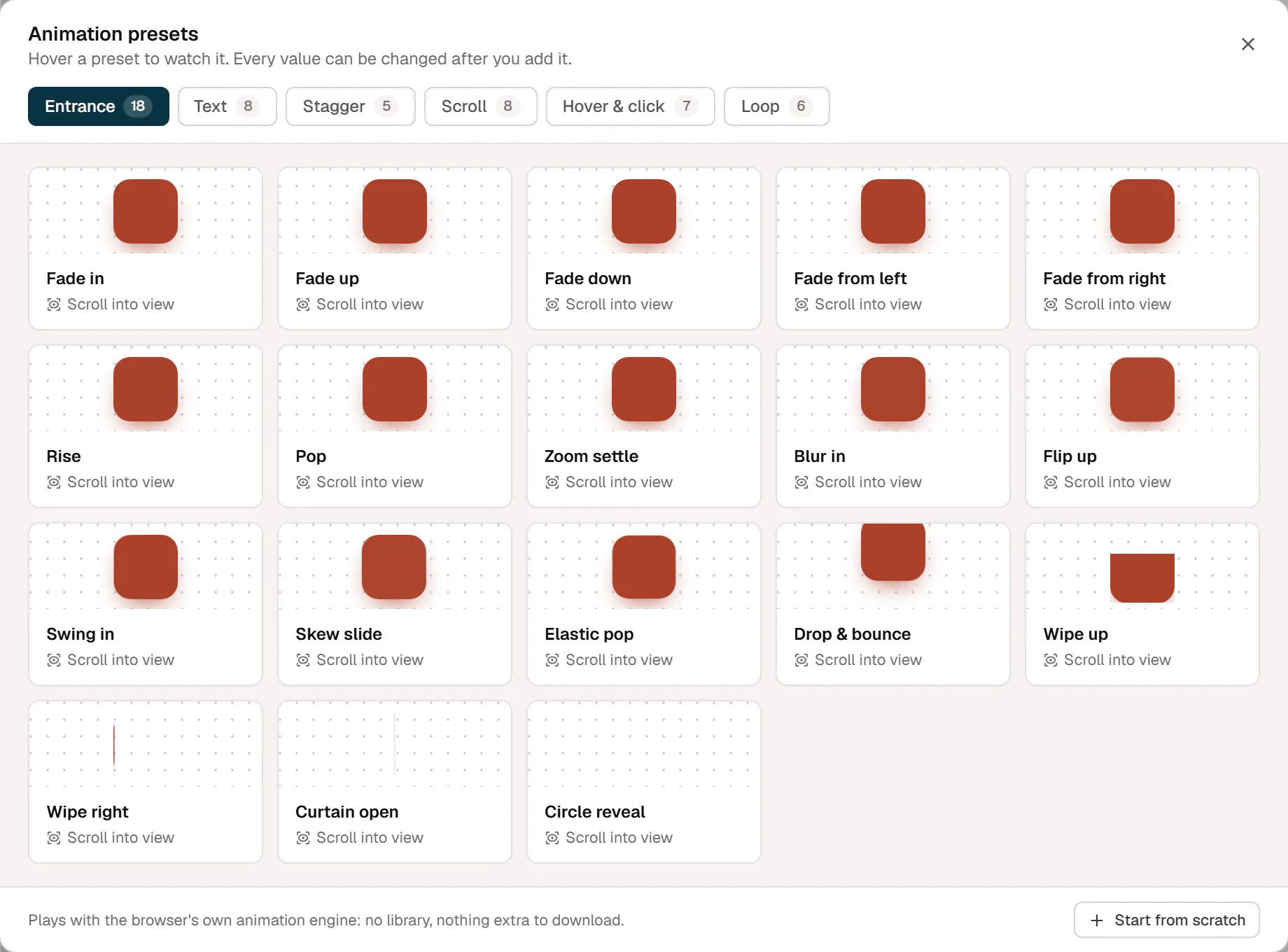
Hover a preset to watch it, then click it. There are more than 50, in six groups:
- Entrance: Fade in, Fade up, Rise, Pop, Zoom settle, Blur in, Flip up, Swing in, Wipe up, Curtain open, Circle reveal and more.
- Text (for headings and text): Words rise, Words from a mask, Lines from a mask, Letters fade, Letters pop, Typewriter and more.
- Stagger (for containers): Cascade up, Pop in turn, From the center, Cards flip, Random fade.
- Scroll: Parallax, Fade & grow in, Wipe reveal, Zoom through, Rotate, Slide across, Focus in & out, Letters on scroll.
- Hover & click: Lift, Grow, Tilt, Spin, Letters wave, Jelly, Press bounce.
- Loop: Float, Pulse, Sway, Spin, Wiggle, Heartbeat.
Or click Start from scratch for a simple fade-up to build on.
Adjust it
The animation appears as a card. Open it to change the trigger, timing and steps, and click the play button (Preview on the canvas) to see it again.
Triggers
| Trigger | When it plays |
|---|---|
| Scroll into view | When the element comes into view. Replay: Once, Every time it comes into view or Play back when it leaves. Starts at sets how far up the screen the element must be. |
| Page load | As soon as the page opens. |
| Scroll scrub | Follows the scrollbar while the element crosses the screen: scroll down and it plays, scroll up and it rewinds. Range and Catch-up control the details. |
| Hover | On hover or keyboard focus, and back when the pointer leaves. |
| Click | On click. With Toggle, a second click plays it back. |
| Loop | Forever, resting while the element is off screen. |
What is animated
- Animate: The element, Child items, one by one (for a container of cards), or, on text widgets, Words, one by one, Letters, one by one or Lines, one by one. Mask makes each word slide out from behind its own edge.
- Stagger sets the time between one item and the next, and the order: First to last, Last to first, From the center, From the edges or Random.
- Start is where the animation starts, for example opacity 0 and 30 px lower. Leave it empty to start as styled.
- Steps: each step has a duration, an easing (such as Strong out, Back or Elastic, in, out or in-out) and the properties it animates. Click + Property to add Opacity, Move X, Move Y, Scale, Rotate, Skew, Blur, Clip reveal or Frame (sprite). Click Add step for a sequence.
- Delay, Repeat and Yoyo (play every other repeat backward).
- Runs on: turn the animation off on desktop, tablet or mobile.
An element can have several animations, for example an entrance and a hover effect. The card menu has Duplicate animation and Delete animation. On the canvas, animations play only when you preview them; on the live site they run with the browser's own animation engine, with nothing extra to download.
Scroll scenes
A scroll scene pins a screen in place while the visitor keeps scrolling, and the scroll drives what happens on it: a product that turns and changes colour, a story told in steps, a row of pictures that flies apart. It is built from two containers:
- A tall container, the track: give it a minimum height of the screen plus the scroll the scene should take, for example
calc(100vh + 3000px)in its custom CSS. - Inside it, a container one screen high with Sticky set to the top (see Make an element sticky): the stage. Place the scene's layers in it, usually absolutely positioned on top of each other.
Give the layers Scroll scrub animations. Inside a pinned stage, a scrub runs while the stage is pinned, through the whole track: 0% when the track's top reaches the top of the screen, 100% when its bottom reaches the bottom. Every layer then shares one timeline, so a step that starts after a delay of 1600 and lasts 150, in a scene whose steps add up to 3000, starts a little past halfway. Keeping Range at 0–100 and timing everything with step delays and durations is the easiest way to line layers up; Catch-up smooths the motion.
A swap between two scenes is often three animations at the same moment: the old layer leaves (Move Y up), the new one comes in (Move Y from below), and the new colour wipes in (Clip reveal, Wipe up). Visitors who prefer reduced motion see the stage as styled, so style the layers in their resting place and, if the scene has several screens, give the track and the stage a reduced-motion rule that lays the screens out one under another.
Turning products: sprite frames
A sprite is a picture made of many frames of the same object, for example a can photographed from 24 angles. The element shows one frame at a time, and the Frame (sprite) property moves through them, so the object turns as the page scrolls, on hover or on a loop.
- Make the frames into one image: side by side in one row, or a sheet in rows (left to right, then the next row). WordPress scales uploads over 2560 pixels down; a sheet keeps working when that happens, a long strip loses its sharpness.
- Set the image as the element's Background image.
- In Behaviour → Animations, set Sprite frames to the number of frames and, for a sheet, Sprite rows to its rows. Give the element the shape of one frame (for example Aspect ratio in its custom CSS).
- Add an animation and animate Frame (sprite): whole numbers, 0 is the first frame. Frames wrap, so −3 is three frames back from the first and the object can turn either way.
Frames change one at a time, never in between. Put Frame in its own animation and move or rotate the element with another one, on a container around it.
Motion & effects
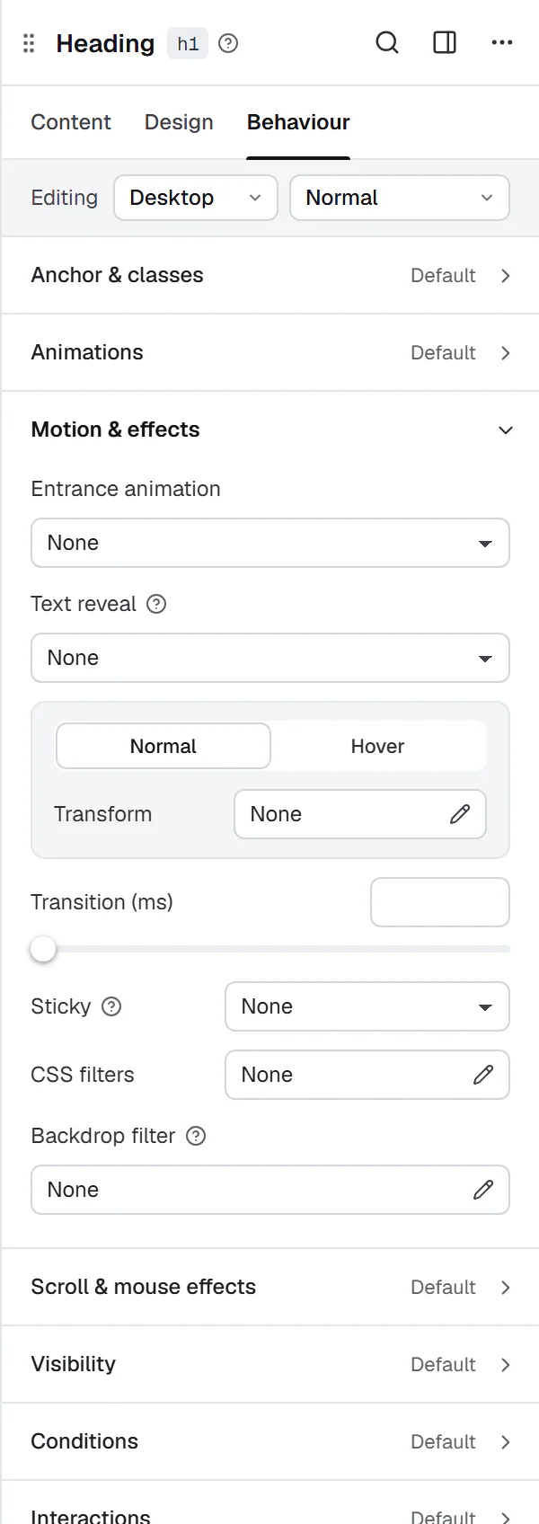
Behaviour → Motion & effects holds simpler effects.
Entrance animation
A quick way to fade or slide an element in when it scrolls into view: choose Entrance animation (Fade in, Fade up, Fade down, Fade from left, Fade from right, Zoom in, Zoom out, Slide up, Slide down, Slide from left, Slide from right, Flip up, Blur in or Drop in (falls and bounces)) and set Duration (ms) and Delay (ms). The fades and slides also take Distance (px): how far the element travels as it comes in (left empty, fades move 28 pixels up or down and 36 sideways, slides 80 and 100). A longer distance, such as 100, gives the slower, sweeping entrance many templates use for whole sections. For more control, use Animations above.
Drop in (falls and bounces) makes the element fall in from above the screen and bounce before it settles, for example a few badges or product photos dropping into a hero. It takes 1.3 seconds unless you set Duration (ms). Unlike the other entrance animations, it starts when the container it falls into comes into view, not the element itself, so an element that lands near the bottom of the screen does not wait out of sight. Several elements in the same container drop in together; give each a different Delay (ms) to drop them one after another. An element that is rotated or scaled keeps its rotation and scale while it falls. When you import a site from Elementor, its Bounce In Down entrance animation becomes Drop in.
On headings and text, Text reveal animates the text Word by word, Letter by letter or Line by line as it scrolls into view, with a Reveal effect (Fade up, Fade, Blur in, Slide up from a mask, Flip up), Stagger (ms), Reveal duration (ms) and Reveal delay (ms).
Rise (px) sets how far each piece moves up as it appears, for Fade up and Blur in. Empty, Fade up rises about half a line and Blur in does not move. Blur in with a rise of 12 and a Blur (px) of 4, word by word, is the soft entrance many Framer templates use for their large headings.
Set Trigger to Follow the scroll to tie the reveal to the scroll position: the text starts faint and lights up piece by piece as the visitor scrolls down, and dims again on the way back. Start opacity sets how visible the text is before it lights up (0.2 by default), and Blur (px) how soft it is with Blur in (4 by default). Word by word with Blur in gives the popular "statement" look for an intro paragraph.
Transform and transform on hover
The Normal tab has Transform, the Hover tab Transform on hover. Each can move (Offset X, Offset Y), Rotate, Scale and skew (Skew X, Skew Y) the element. For example, a card that rises on hover: Transform on hover → Offset Y −6 px.
Transition (ms) makes the change between normal and hover smooth, for transforms and also for colors, backgrounds, shadows and borders. 200 to 300 ms feels natural.
Make an element sticky
Sticky keeps an element in view while the page scrolls, within its parent container:
- Set Sticky to Top (or Bottom).
- Set Sticky offset (px), the distance from the top of the window, for example 100 px to stay below a sticky header.
- In Sticky on, keep the devices where it should stick. Elsewhere it scrolls with the page.
A sticky element sticks only while its parent container is on screen. A typical use is a sidebar column next to a long text. For a sticky site header, use the header's own setting instead; see Page settings.
Hide while scrolling down works inside a sticky header: the element slides out of view while the page scrolls down and comes back when it scrolls up, while the rest of the header stays. See Page settings.
Endless scroll
Endless scroll (containers only) moves a container's content round and round like a ticker: a strip of client logos drifting left, or review cards running up in columns.
- Select the container that holds the items (the logos or the cards), not the whole section.
- Set Endless scroll to Left, Right, Up or Down.
- Set Seconds per round, the time one full round takes. Empty means 40 seconds; fewer seconds is faster.
- Turn on Fade the edges to soften where the content enters and leaves.
For Up and Down, give the container a fixed height (for example in Custom CSS: selector { height: 640px; }). Without one, the container grows to show everything and has nowhere to move. Three columns side by side, two running up and the middle one down, make a moving wall of reviews.
The content pauses while the pointer is over it or while something inside it has keyboard focus. Visitors whose device asks for reduced motion see the items standing still, and a tall column can be scrolled instead. The second copy that keeps the loop seamless is hidden from screen readers. Endless scroll does not run in the editor; preview the page to see it move.
For a line of plain texts, icons or logos, the Marquee widget has more options, such as rows and hover speed.
Filters
- CSS filters: Blur, Brightness, Contrast, Saturate, Grayscale and Hue, for example a grayscale logo.
- Backdrop filter: blurs or tints what shows through the element, for the frosted-glass look. Give the element a semi-transparent background for it to show.
Scroll & mouse effects
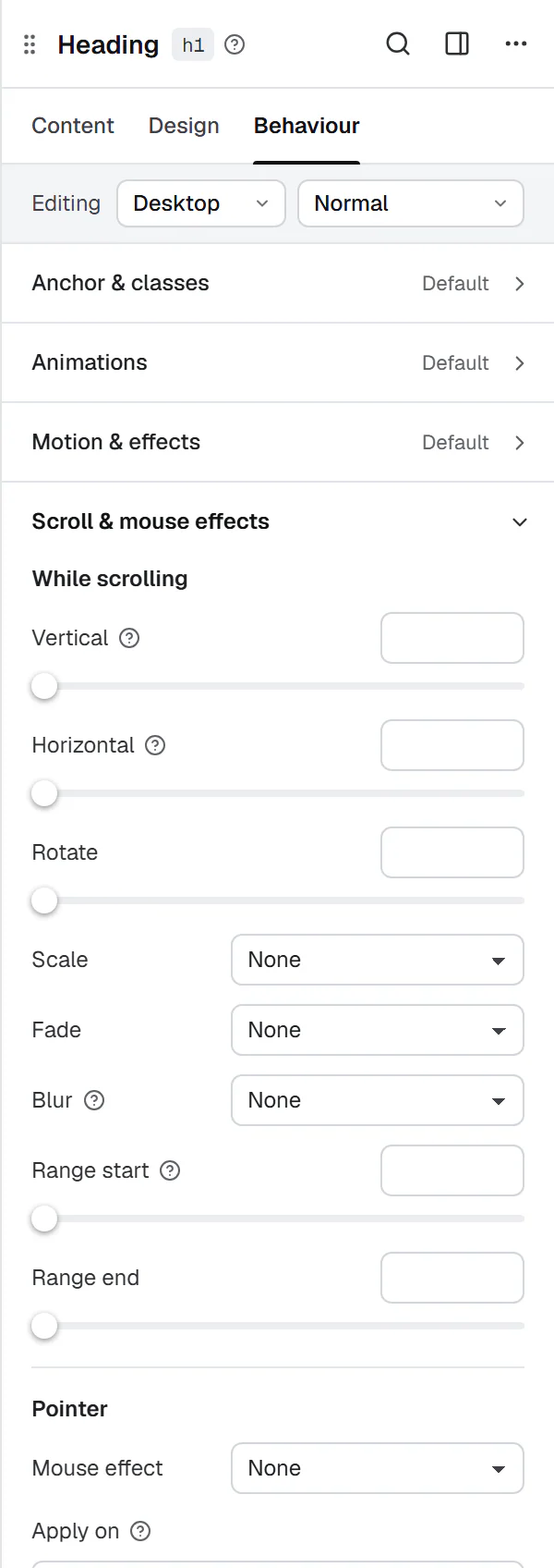
Behaviour → Scroll & mouse effects moves elements with the scroll or the mouse pointer on the live site.
While scrolling
| Setting | What it does |
|---|---|
| Vertical | −10 to 10. Positive moves up faster than the page, negative lags behind (parallax). |
| Horizontal | Positive drifts right as the page scrolls down. |
| Rotate | Turns the element as the page scrolls. |
| Scale | Grow into place, Shrink as it leaves, Grow in, shrink out, Grow while scrolling or Shrink while scrolling, with Amount (%). |
| Fade / Blur | In (as it enters), Out (as it leaves) or In and out. |
| Range start / Range end | The part of the element's trip across the screen where the effect runs, from 0 (entering at the bottom) to 100 (leaving at the top). |
Pointer
- Mouse effect: Follow the pointer (the element drifts with the mouse) or 3D tilt on hover, with Strength. Works on devices with a mouse.
- Apply on: the devices where the effects run. Empty means every device.
These effects do not run in the editor. Preview the page to see them.
Keep it tasteful
- Animate a few important things, not everything. One entrance per section is usually enough.
- Keep durations short: 300 to 800 ms for entrances, under 300 ms for hover.
- Avoid animating large text blocks word by word; it slows down reading.