Additional Information
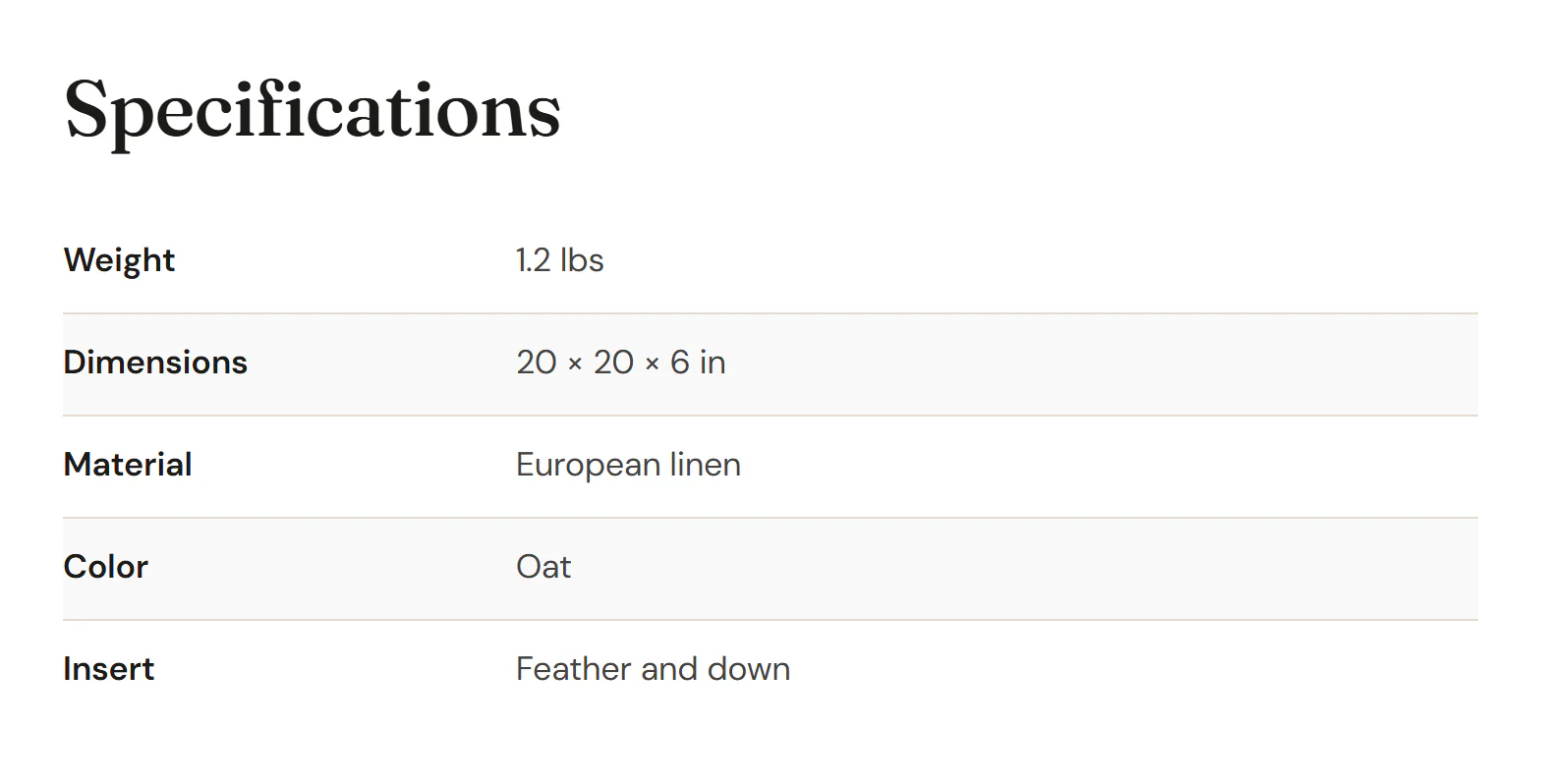
A table of the product's attributes, weight and dimensions.
On this page
The Additional Information widget shows WooCommerce's table of product details: the attributes you mark as visible on the product page (such as Material or Color), and the weight and dimensions. It is the same table as the Additional information tab of the Product Tabs widget, so use it when you want the details as a section of their own, for example beside the description.
Where the product comes from
The widget shows the product being viewed: on a product page template it is the product the visitor opened, and in a product loop item it is each card's product. To show one particular product anywhere else, pick it in the Product section of the Content tab.
You set attributes, weight and dimensions in the product's Product data box in WooCommerce. When the product has none of them, the editor shows This product has no attributes, weight or dimensions to list. and the live page shows nothing.
Add Additional Information
Open your product page template in the Theme Builder. Then click Insert in the rail on the left, find Additional Information in the WooCommerce group (or type "attributes" in the search box) and drag it into the template. See Add elements.
If the template also has Product Tabs, turn off Additional information in its Product tabs section, so the table does not appear twice.
Content tab settings
| Setting | What it does |
|---|---|
| Heading | An optional heading above the table, such as "Specifications". Empty: no heading. |
| Heading tag | H1 to H6, DIV, SPAN or P. Default: H2. Shown when there is a heading. |
| Setting | What it does |
|---|---|
| Product | Leave empty to show the product being viewed (product pages, product loop items). Pick a product to show it on any page. |
Design tab settings
| Section | Settings |
|---|---|
| Table | Label column width, Cell padding, Row lines (their color) and Striped rows (the background of every other row). Under Labels: Typography and Color. Under Values: Typography and Color. |
| Heading | Typography, Color and Space below. Shown when there is a heading. |
The Design tab also has the sections every element shares: Spacing & position, Background & border and Mask. See Spacing, size & position.
Behaviour tab
The Behaviour tab has the settings every element shares: anchor and classes, entrance animations, motion effects, visibility per device, display conditions and interactions. See Visibility.
Tips
- An attribute only shows in the table when Visible on the product page is ticked for it in the product's Attributes.
- Give the label column a fixed width, around 30%, so the values line up.