Product Title
The name of the product, for product page templates and product cards.
On this page
The Product Title widget shows the name of a WooCommerce product. Use it as the main heading (H1) of your product page template, and as a linked title in product cards, where each card shows its own product's name.
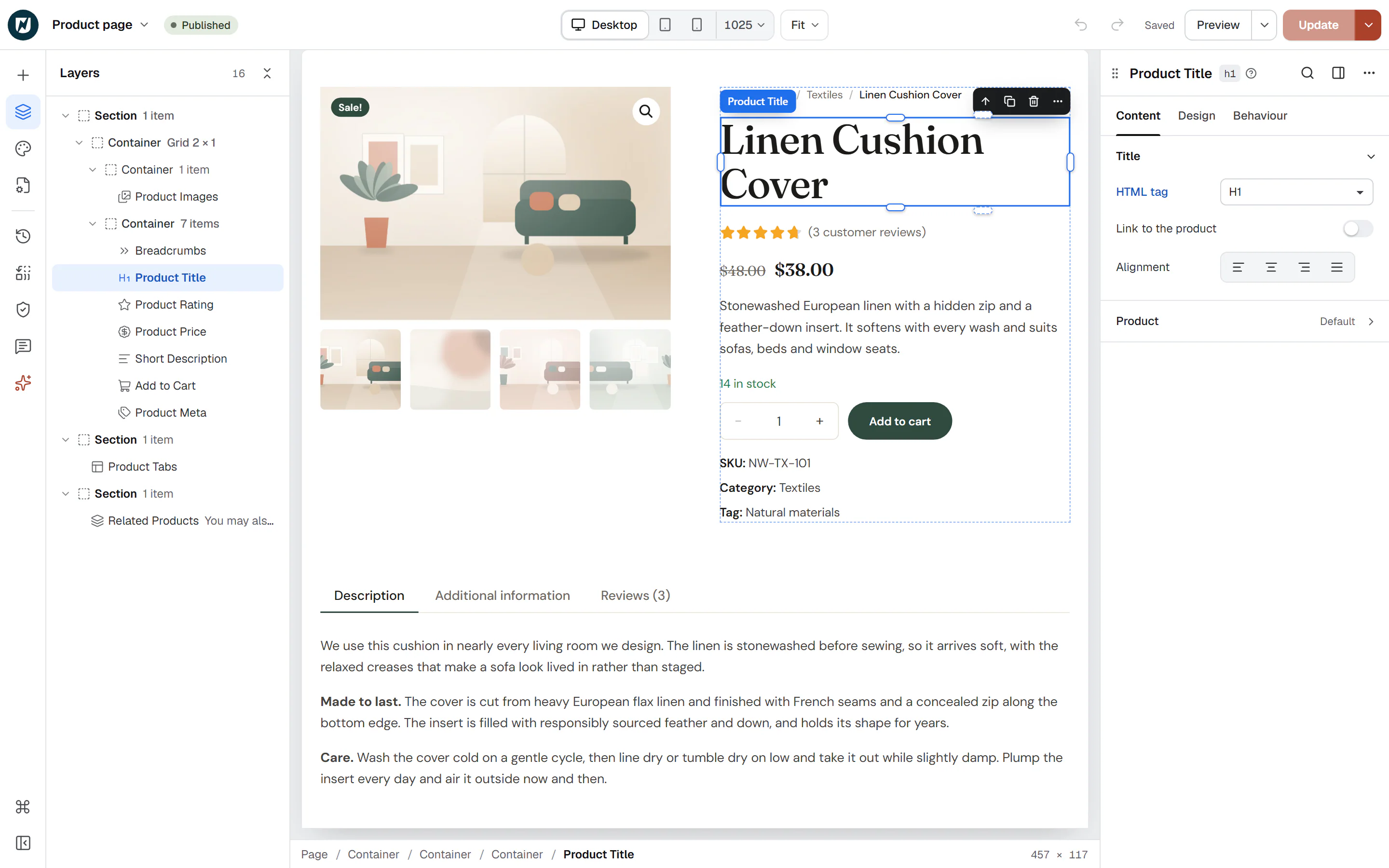
Where the product comes from
The widget shows the product being viewed: on a product page template it is the product the visitor opened, and in a product loop item it is each card's product. To show one particular product anywhere else, such as on a landing page, pick it in the Product section of the Content tab.
The name is the one you type when you edit the product in WooCommerce. Change it there, and every template and card that shows it updates.
In a product template, the editor shows the product chosen in Preview with in the Template settings, or your latest product. On a page without a product to show, the editor previews your latest product, but the live page shows nothing until you pick one in Product.
Add a Product Title
Open your product page template or a product loop item in the Theme Builder. Then click Insert in the rail on the left, find Product Title in the WooCommerce group (or type "product" in the search box) and drag it into the template. See Add elements.
The WooCommerce group only appears while WooCommerce is active.
Use it in a card
In a product loop item, set HTML tag to H3 (or H2) and turn on Link to the product. The page then keeps a single H1, and each card's name leads to its product page.
Content tab settings
| Setting | What it does |
|---|---|
| HTML tag | H1 to H6, DIV, SPAN or P. Default: H1. Use H1 in product templates and H2 or H3 in product cards. |
| Link to the product | Makes the name a link to the product page. Off by default. |
| Open in a new tab | Opens the link in a new tab. Shown when Link to the product is on. |
| Alignment | Left, Center, Right or Justify. Can differ per device. |
| Setting | What it does |
|---|---|
| Product | Leave empty to show the product being viewed (product pages, product loop items). Pick a product to show it on any page. |
Design tab settings
| Section | Settings |
|---|---|
| Title | Typography, Color, Link hover color (when linked), Max width, Text wrap (Balanced evens out line lengths, Pretty avoids a single word on the last line), Text shadow, Text stroke and Stroke color (an outline around the letters). |
The Design tab also has the sections every element shares: Spacing & position, Background & border and Mask. See Spacing, size & position.
Behaviour tab
The Behaviour tab has the settings every element shares: anchor and classes, entrance animations, motion effects, visibility per device, display conditions and interactions. See Visibility.
Tips
- Keep one H1 per product page. Use H2 for the headings further down, such as Related products.
- While your store has no products yet, the editor shows Add a product to your store to preview this widget. in place of the name.