Products
A grid of products: the shop and category listing, or latest, featured, on sale, best selling, chosen or related products, with pages and sorting.
On this page
The Products widget shows a grid of WooCommerce products in WooCommerce's own product cards: image, sale badge, name, rating, price and add to cart button. Use it for the product list of your shop and category pages, and for sections such as "New arrivals", "On sale now" or "Best sellers" on any page. Since the cards are WooCommerce's, extensions that add to product cards, such as wishlists or color swatches, keep working.
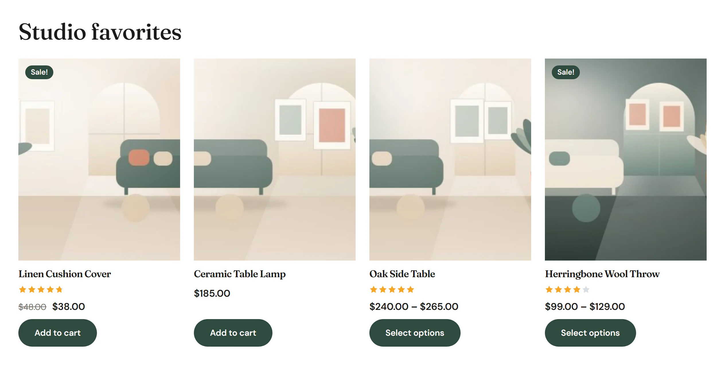
Add Products
Click Insert in the rail on the left and find Products in the WooCommerce group, or type "products" in the search box. Drag it onto the canvas, or click it to add it next to the selected element. See Add elements.
A new Products widget shows your eight latest products. Change this with Show.
Choose which products to show
| Show | Products |
|---|---|
| Current listing (shop, category, search) | What the visitor is browsing: the shop, a product category or tag, or product search results. Use it in a Product archive template. It uses WooCommerce's number of products per page and comes with the sorting menu, the result count and page numbers. The editor previews your latest products. |
| Latest products | The newest products first. |
| Featured products | Products marked as featured (the star in Products → All Products). |
| Products on sale | Products with a sale price right now. |
| Best selling | The products with the most sales. |
| Top rated | The products with the best average rating. |
| From categories or tags | Products in the Categories and Tags you pick. |
| Chosen products | The Products you pick. With Order on Newest first, they keep the order in which you picked them. |
| Related to the product viewed | WooCommerce's related products of the product page being viewed: products that share a category or tag with it. |
| Upsells of the product viewed | The upsells set in the product's Product data → Linked products. |
| Cross-sells of the cart | The cross-sells of the products in the visitor's cart. Use it on the cart page. The editor has no cart, so it shows the cross-sells of the preview product. |
Every list follows WooCommerce's rules: hidden products stay hidden, and out-of-stock products are left out when Hide out of stock items from the catalog is on in WooCommerce → Settings → Products → Inventory.
Related products, upsells and cross-sells show nothing when there are none, heading included, unless you type a Text when there are no products. The other lists show the text, or WooCommerce's "No products were found matching your selection."
Pages, sorting and result count
Current listing always has page numbers, and shows the sorting menu and the result count ("Showing 1–12 of 30 results") unless you turn them off. For Latest, Featured, On sale, Best selling, Top rated and From categories or tags, turn on Pages to page through the list; Number of products then sets how many per page. Result count and Sorting menu only appear on lists with pages, and you can turn each off.
On shop pages, WooCommerce's messages, such as "added to your cart", appear above the grid.
Content tab settings
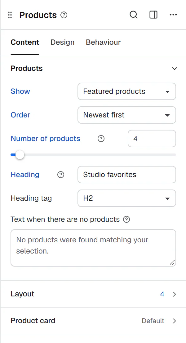
| Setting | What it does |
|---|---|
| Show | Which products to list. See above. Default: Latest products. |
| Products | The products to show. For Chosen products. |
| Categories, Tags | The product categories and tags to show products from. For From categories or tags. |
| Order | Newest first, Popularity (sales), Average rating, Price: low to high, Price: high to low, Name (A to Z), Custom order (menu order) or Random. Default: Newest first. Not for Current listing, Best selling and Top rated, which have their own order. |
| Number of products | 1–100. Default: 8. Per page when the list has pages. Not for Current listing. |
| Heading | An optional heading above the products, such as "You may also like". It is hidden together with the products when there are none. |
| Heading tag | H1 to H6, DIV, SPAN or P. Default: H2. Shown when there is a heading. |
| Text when there are no products | Your own "nothing found" text. Empty: WooCommerce's text. |
| Setting | What it does |
|---|---|
| Columns | 1–8. Empty: 4 on desktops, 3 on tablets, 2 on phones. Can differ per device. |
| Column gap, Row gap | Space between the cards. Can differ per device. |
| Pages | Page numbers below the grid when there are more products. For Latest, Featured, On sale, Best selling, Top rated and From categories or tags. Off by default. |
| Result count | "Showing 1–12 of 30 results", on lists with pages. On by default. |
| Sorting menu | Lets shoppers sort by price, popularity and more, on lists with pages. On by default. |
| Setting | What it does |
|---|---|
| Image | The product image. On by default. |
| Second image on hover | Shows the first gallery image while the pointer is over the card. Shown when Image is on. |
| Sale badge | WooCommerce's sale badge on products on sale. On by default. |
| Name | The product name. On by default. |
| Rating | The stars, for products with ratings. On by default. |
| Price | The price. On by default. |
| Add to cart button | WooCommerce's button: Add to cart, Select options or Read more, depending on the product. On by default. |
| Alignment | Left, Center or Right for the card content. Can differ per device. |
Design tab settings
| Section | Settings |
|---|---|
| Card | Background, Padding, Border, Border radius, Shadow, Shadow on hover and Space between parts. |
| Image | Border radius, Shape (As uploaded, Square, Portrait 4:5, Portrait 3:4 or Landscape 4:3), Background and Zoom on hover. |
| Name | Typography, Color and Hover color. |
| Price | Typography, Color and Crossed-out price color. |
| Rating | Size, Color and Empty color of the stars. |
| Button | Full width, Typography; Text color, Background and Border (Normal tab); Text color, Background and Border color (Hover tab); Padding and Border radius. |
| Sale badge | Typography, Text color, Background, Border radius and Position (Top left or Top right). |
| Heading | Typography, Color, Alignment and Space below. Shown when there is a heading. |
| Pages | Alignment, Typography, Color, Current page text and Current page background. Under Result count and sorting: Typography and Color. |
Each card section only appears while its part is on. The button follows Design System → Buttons, and prices, the badge and stars follow Design System → Shop, until you change them here. See Shop styles. The Design tab also has the sections every element shares: Spacing & position, Background & border and Mask. See Spacing, size & position.
Behaviour tab
The Behaviour tab has the settings every element shares: anchor and classes, entrance animations, motion effects, visibility per device, display conditions and interactions. See Visibility.
Tips
- Upload product images with the same proportions, or set the Shape under Image, so the cards line up.
- The card buttons add to the cart without reloading the page when Enable AJAX add to cart buttons on archives is on in WooCommerce → Settings → Products.
- Want a card with your own layout? Design a product loop item and show it with a Loop Grid. See Shop pages.