Cart
The shopping cart: products with quantities, coupon, totals and the button to the checkout. Place it on the cart page.
On this page
The Cart widget shows WooCommerce's cart: the table of products with their image, price, quantity and subtotal, the coupon field and Update cart, and the cart totals with shipping and Proceed to checkout. It is WooCommerce's classic cart with your layout and styles, so shipping calculators, payment buttons and other extensions that add to the cart keep working.
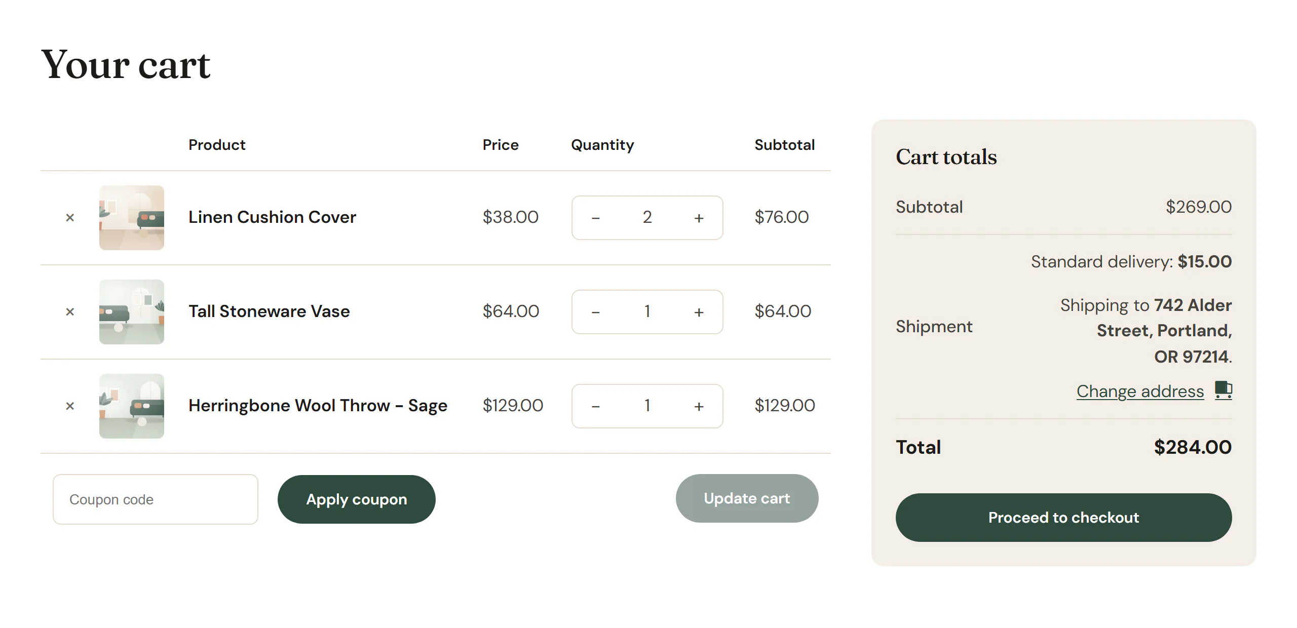
Where to place it
Place the widget on your store's cart page: the page chosen as Cart page in WooCommerce → Settings → Advanced → Page setup. WooCommerce's links, such as View cart, lead there. See Cart, checkout & account for the steps.
Any page that holds the Cart widget counts as a cart page for WooCommerce, so its scripts and checks work there too.
When the cart is empty, visitors see WooCommerce's "Your cart is currently empty." message with a button back to the shop.
In the editor
The editor has no cart, so the widget shows a sample cart with your two latest products, so you can design the table, totals and button. The sample cannot be changed or sent. While your store has no products, it shows the empty cart message.
Add a Cart
Open your cart page with Edit with Uncoder. Then click Insert in the rail on the left, find Cart in the WooCommerce group (or type "cart" in the search box) and drag it into a section. See Add elements.
Content tab settings
| Setting | What it does |
|---|---|
| Totals | Beside the products or Below the products. Empty: beside on desktops, below on tablets and phones. Can differ per device. |
| Totals width | Width of the totals box when it is beside the products. Can differ per device. |
| Gap | Space between the products and the totals. Can differ per device. |
| − / + buttons | Buttons on each side of the quantity fields. On by default. |
| Cross-sells | WooCommerce's "You may be interested in…" products under the cart. Off by default. A Products widget showing Cross-sells of the cart gives more control. |
Design tab settings
| Section | Settings |
|---|---|
| Products table | Header typography, Header color, Header background, Typography, Text color, Product name color, Lines, Cell padding, Image size and Remove (×) color. |
| Totals | Background, Padding, Border, Border radius, Heading typography, Heading color and Total typography. |
| Checkout button | Typography, Text color, Background, Hover background and Border radius. |
The cart's buttons follow Design System → Buttons, as the note in Checkout button says; change the checkout button here for this widget only. See Buttons. The Design tab also has the sections every element shares: Spacing & position, Background & border and Mask. See Spacing, size & position.
Behaviour tab
The Behaviour tab has the settings every element shares: anchor and classes, entrance animations, motion effects, visibility per device, display conditions and interactions. See Visibility.
Tips
- Keep the cart page simple: a heading, the Cart widget and, below it, a Related Products widget showing Cross-sells of the cart.
- The cart page shows WooCommerce's messages, such as "Cart updated.", inside the widget.