Product Images
The product image and gallery: WooCommerce's slider with thumbnails, zoom and lightbox, or every image in a grid.
On this page
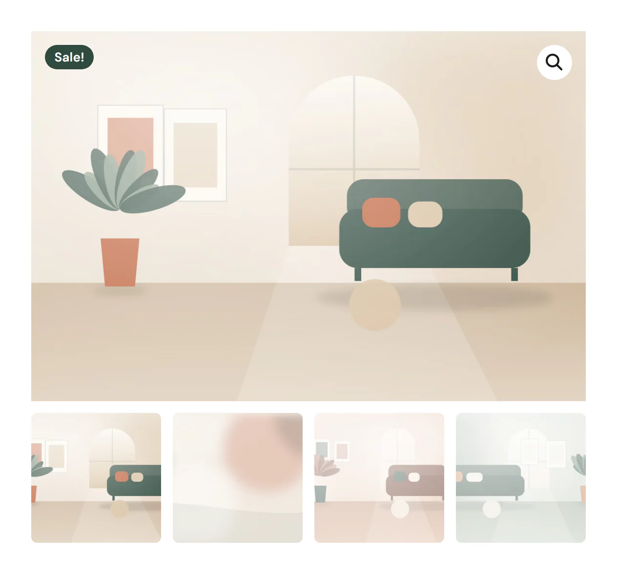
The Product Images widget shows the main image of a WooCommerce product and the images of its gallery. Place it in the left column of your product page template. Choose WooCommerce's own gallery, with a slider, thumbnails, zoom and a full-screen view, or show every image at once in a grid or a single column.
Where the product comes from
The widget shows the product being viewed: on a product page template it is the product the visitor opened, and in a product loop item it is each card's product. To show one particular product anywhere else, pick it in the Product section of the Content tab.
The images are the Product image and the Product gallery you set when you edit the product in WooCommerce. A product without images shows WooCommerce's placeholder image.
Add Product Images
Open your product page template in the Theme Builder. Then click Insert in the rail on the left, find Product Images in the WooCommerce group (or type "gallery" in the search box) and drag it into the template. See Add elements.
Choose a layout
- Gallery with thumbnails (default) is WooCommerce's gallery: one large image with a row of thumbnails below, or a column of them on the left or right. Visitors zoom by hovering the image, swipe between images, and open them full screen with the button in the corner. The notice in the settings reminds you that zoom, the full-screen view and sliding come from WooCommerce and work on the site and in Preview.
- Grid shows every image at once, in 1 to 4 columns. First image full width makes the main image span the whole row.
- One column stacks every image under each other, a common layout beside a sticky product summary.
In Grid and One column, each image opens in the lightbox when Open image links in the lightbox is on in the Design System (it is by default). See Lightbox & site behaviour.
When a shopper picks the options of a variable product, such as a color, WooCommerce shows that option's image: as the large image of the gallery, or as the first image of the grid or column.
Once a Single product template is live, the gallery's zoom, full-screen view and slider are on, whatever your theme declares.
Show a sale badge
Turn on Sale badge to show a badge on the image while the product is on sale. It reads Sale! unless you type your own Badge text. In the editor the badge also shows on products that are not on sale, so you can style it. To show the discount in percent or a "Sold out" badge, use the Sale Badge widget instead.
Content tab settings
| Setting | What it does |
|---|---|
| Layout | Gallery with thumbnails, Grid or One column. Default: Gallery with thumbnails. |
| Thumbnails | Where the thumbnails sit: Below, Left or Right. Default: Below. Gallery only. |
| Thumbnails per row | 2–8. Shown when the thumbnails are below the image. Can differ per device. |
| Columns | 1–4. Grid only. Can differ per device. |
| First image full width | The first image spans the whole row. Grid only. |
| Sale badge | A badge on the image while the product is on sale. Off by default. |
| Badge text | The badge's text. Default: Sale!. Shown when Sale badge is on. |
| Setting | What it does |
|---|---|
| Product | Leave empty to show the product being viewed (product pages, product loop items). Pick a product to show it on any page. |
Design tab settings
| Section | Settings |
|---|---|
| Images | Gap, Border radius and Background of the images. For the gallery, under Thumbnails: Column width (thumbnails on the left or right), Border radius, Opacity of the others (the thumbnails that are not shown, 0.1–1) and Current thumbnail outline; under Full-screen button: Icon color and Background. |
| Sale badge | Typography, Text color, Background, Border radius and Position (Top left or Top right). Shown when Sale badge is on. |
The badge takes the colors of Design System → Shop → Sale badge until you change them here. See Shop styles. The Design tab also has the sections every element shares: Spacing & position, Background & border and Mask. See Spacing, size & position.
Behaviour tab
The Behaviour tab has the settings every element shares: anchor and classes, entrance animations, motion effects, visibility per device, display conditions and interactions. See Visibility.
Tips
- Upload product images with the same proportions, for example all square. The gallery then keeps the same height from image to image.
- With One column, make the summary column beside it sticky (Behaviour → Motion & effects → Sticky), so the price and Add to Cart stay in view while visitors scroll the images. See Make an element sticky.