Mini Cart
A cart icon for the header with the number of items and the subtotal. Opens a cart drawer or goes to the cart page.
On this page
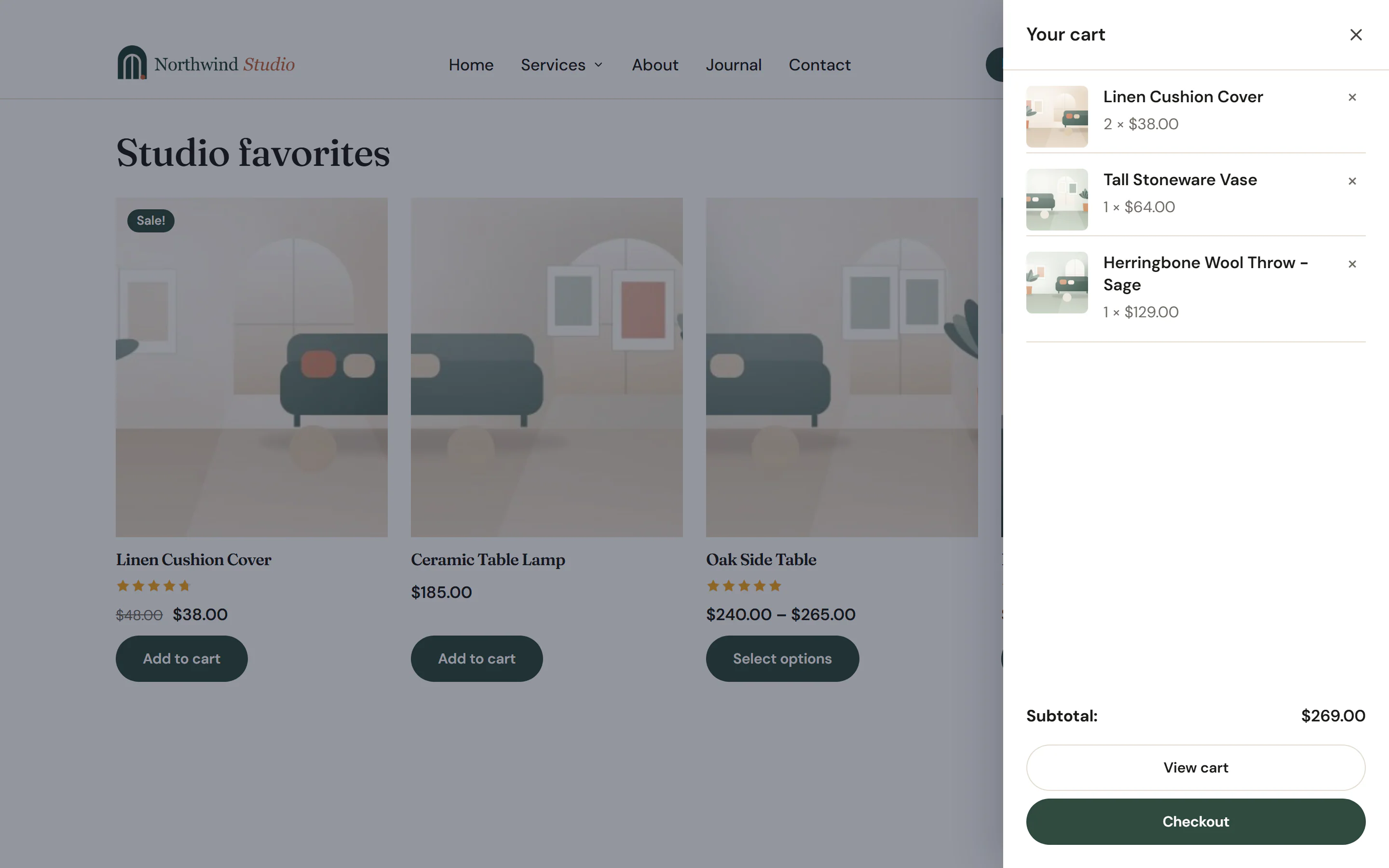
The Mini Cart widget is the cart icon of your header. It shows how many items are in the visitor's cart and, if you like, the subtotal. A click opens a cart drawer that slides in from the side, with WooCommerce's mini cart (the products, the subtotal, View cart and Checkout), or goes straight to the cart page.
How it stays up to date
The count, the subtotal and the drawer update through WooCommerce's cart fragments, WooCommerce's own way of refreshing the cart on every page. They stay right after a product is added without reloading the page, and on pages served from a cache.
- After adding to the cart. When the Add to Cart widget (with Add without reloading the page) or a product card button adds a product, the count updates and the drawer opens if Open after adding to the cart is on. If your header has a different Mini Cart per device, only the one on screen opens.
- On the cart and checkout pages. The icon links to the cart page instead of opening the drawer: the cart is already on screen.
- Keyboard and screen readers. The icon is announced with the count, such as "Cart, 2 items". In the open drawer, focus stays inside; Esc, the × button or a click on the page behind closes it.
In the editor
The editor has no cart, so the icon shows a sample count of 2 and a sample subtotal. To design the drawer, turn on Show the drawer while editing: it opens on the canvas with sample products. It only changes the editor.
Add a Mini Cart
Open your header template in the Theme Builder. Then click Insert in the rail on the left, find Mini Cart in the WooCommerce group (or type "cart" in the search box) and drag it into the header row, usually at the end next to the menu. See Add elements.
Content tab settings
| Setting | What it does |
|---|---|
| Icon | The cart icon. Default: a shopping bag. |
| Number of items | A badge with the number of items. On by default. |
| Hide the number when the cart is empty | Hides the badge at 0. On by default. Shown when Number of items is on. |
| Subtotal | Shows the cart subtotal next to the icon. Off by default. |
| On click | Open the cart drawer or Go to the cart page. Default: Open the cart drawer. |
| Open after adding to the cart | Opens the drawer when a product is added without reloading the page. On by default. Drawer only. |
| Drawer side | Left or Right. Default: Right. Drawer only. |
| Drawer title | The title at the top of the drawer. Default: Your cart. Drawer only. |
| Show the drawer while editing | Editor only: opens the drawer with sample products, so you can style it. Drawer only. |
Design tab settings
| Section | Settings |
|---|---|
| Icon | Size, Color, Hover color, Number background, Number color and Subtotal typography (when Subtotal is on). |
| Drawer | Width, Background, Text color, Page overlay (the shade over the page behind), Title typography, Product typography and Padding. Shown when On click is Open the cart drawer. |
The drawer's View cart and Checkout buttons follow Design System → Buttons. See Buttons. The Design tab also has the sections every element shares: Spacing & position, Background & border and Mask. See Spacing, size & position.
Behaviour tab
The Behaviour tab has the settings every element shares: anchor and classes, entrance animations, motion effects, visibility per device, display conditions and interactions. See Visibility.
Tips
- Turn on Subtotal on desktops only: add two Mini Carts and hide each on the other devices with Behaviour → Visibility.
- The Cart item count dynamic tag can put the count inside other text, such as a button "Cart (2)", but it shows the count of when the page loaded. Only the Mini Cart updates by itself. See Dynamic tags.