Nav Menu
A WordPress menu with dropdowns, mega menus and a mobile menu.
On this page
The Nav Menu widget shows one of your WordPress menus, usually as the main navigation in your header. It handles dropdown submenus and mega menus, marks the current page, and turns into a hamburger button with a mobile menu on smaller screens.

Where the menu comes from
The links come from a menu you manage in WordPress, in Appearance → Menus: add pages, posts, categories or custom links there, drag them into order, and nest them to create dropdowns. Choose which menu the widget shows in Menu. When you change the menu in WordPress, every Nav Menu that shows it updates.
To show a full panel of content instead of a simple dropdown, attach a mega menu template to a menu item. See Mega menus.
Add a Nav Menu
Open your header template in the Theme Builder. Then open Insert in the left panel, find Nav Menu in the Site & theme group (or type "menu" in the search box) and drag it into the header. See Add elements.
Set up the mobile menu
On tablets and phones, the menu turns into a hamburger button by default. Choose when with Show hamburger on, and pick how the menu opens with Mobile menu: a Dropdown under the header, a Panel under the header, an Off-canvas drawer from the side, or Full screen.
The mobile menu shows the same menu as the desktop bar. To show another one, for example a shorter menu or one with extra links for phones, pick it under Mobile menu → Menu.
Panel under the header is the modern, app-style menu: a full-width sheet that hangs from the bottom edge of the header, with airy rows, submenus that open in place with a rotating arrow, and an optional full-width button at the end (Button in the menu). Pair it with Toggle style → Animated lines, whose two lines turn into an X while the menu is open. Give the panel the header's background (Design → Mobile menu → Background) and the header's side padding (Panel padding) so it reads as part of the header.

Check it in the Tablet and Mobile views of the editor. See Responsive editing.
Add hover effects
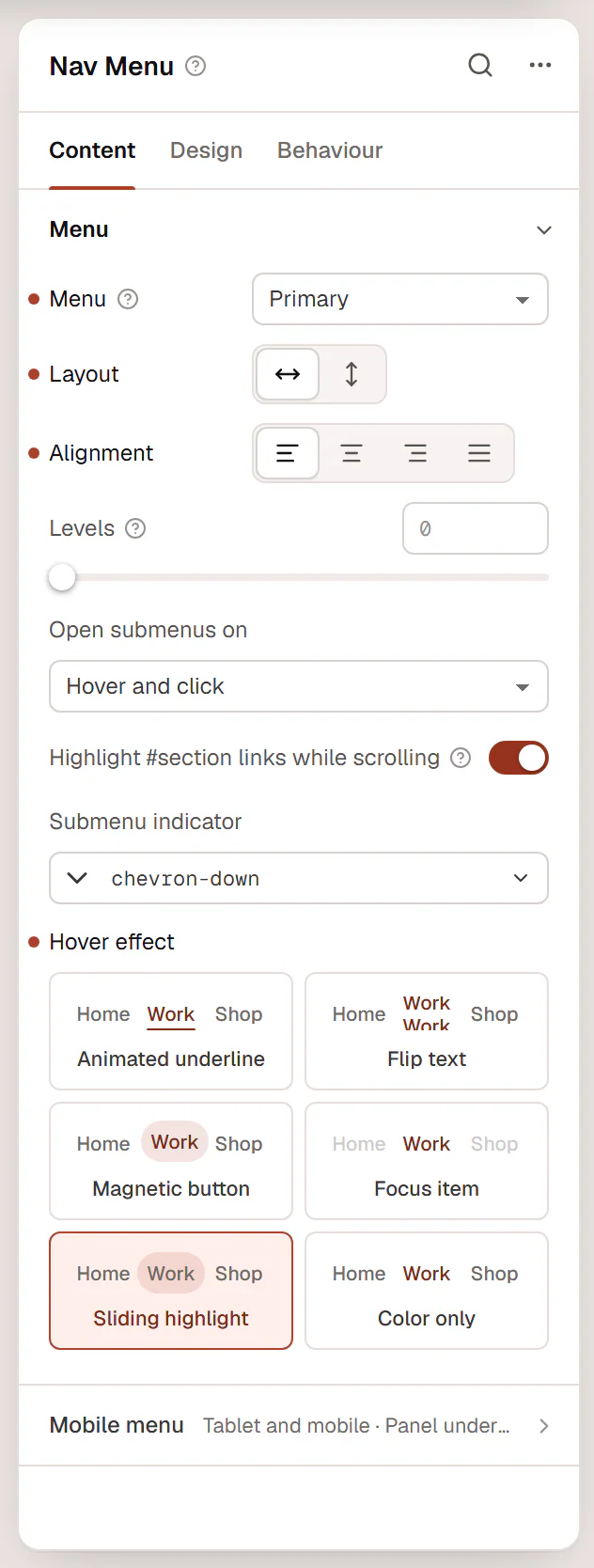
Pick one Hover effect at the end of the Menu section. Each tile shows a small menu with its effect; point at a tile to see it move, then click it. The effect is for the desktop menu, not the mobile menu.
| Effect | What it does |
|---|---|
| Animated underline | A line draws in under the item and leaves the other way. Line from: Start (draws in from the start, leaves at the end) or Center (grows from the middle). The current page keeps its line. The default. |
| Flip text | The label rolls up and a copy rolls in from below. Flip by: Word or Letter (each letter a moment after the one before). |
| Magnetic button | The item becomes a pill that leans toward the mouse pointer, and the label leans a little further. Pull sets how far it follows (default 0.3). |
| Focus item | While the pointer or keyboard focus is on one item, the other items fade back. Dimmed opacity (default 0.35). |
| Sliding highlight | One pill glides from item to item and rests on the current page. |
| Color only | Only the text color changes. |
Set the colors in Design → Main menu: Text color on the Hover and Active tabs, Underline color and Underline thickness for the underline, and Background on the Hover tab for the pill of Magnetic button and Sliding highlight (a light tint of your primary color by default). Visitors who turn on reduced motion see the same states without movement, and Flip text becomes a color change.
Add icons and descriptions
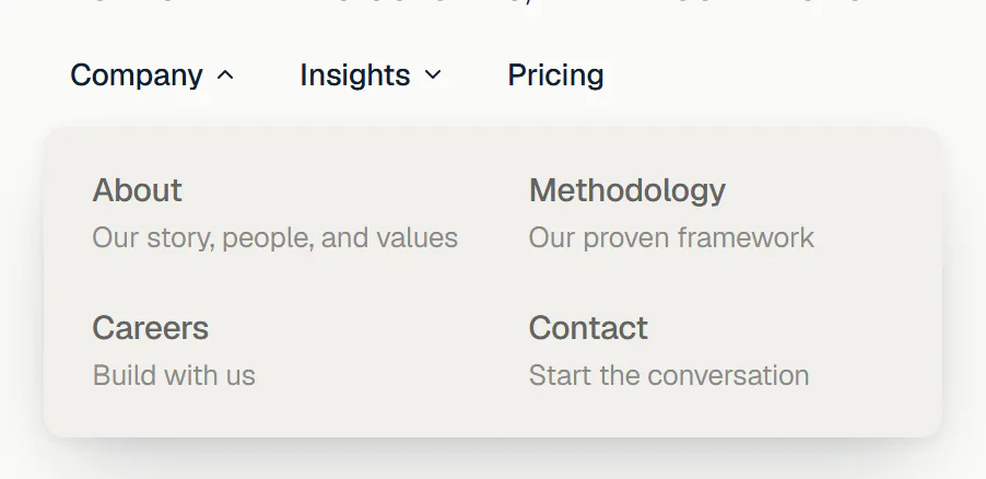
Menu items can have a small icon before the label and a short description under it, so a dropdown says where each link goes.
Open the menu
Go to Appearance → Menus and select the menu your Nav Menu shows.
Add an icon
Expand a menu item and click Choose icon under Icon. Type to search, for example
users, and click an icon. The list at the top switches between icon libraries: Lucide, Font Awesome, Phosphor and the others, and your own sets. Remove takes the icon off again.To use your own icon, click Upload SVG and choose one or more
.svgfiles. They are added to a custom icon set called Menu icons; a single file is picked straight away. Single-color icons work best: like every icon, they take the menu's colors. Uploading is available to administrators. See Custom icons.Add a description
Type one short line in the item's Description field, for example Our story, people, and values. If the field is not there, click Show the Description field under the icon, or turn on Description in Screen Options at the top of the page.
Save the menu
Click Save Menu, then reload the editor to see the change.
Icons show wherever the item appears. Descriptions show under the label in dropdowns and in the mobile menu; items in the menu bar keep just their label.
To lay out dropdowns in columns, like a small mega menu, set Dropdown columns to 2, 3 or 4 in the Menu section. Style icons and descriptions in Design → Dropdown → Icons and descriptions: Icon size, Icon color, Icon background (puts each icon on a small tile), Description typography and Description color. They also apply to the mobile menu. To show a plain menu with the same items, for example in the footer, turn off Icons or Descriptions on that Nav Menu.
Build a one-page menu
If your menu links to sections of the same page (such as #services or #contact), keep Highlight #section links while scrolling on. The link of the section in view is marked as active while the visitor scrolls. Give each section a matching Anchor ID in Behaviour → Anchor & classes.
Content tab settings
| Setting | What it does |
|---|---|
| Menu | Which WordPress menu to show. Empty: the first menu with items. Manage menus in Appearance → Menus. |
| Layout | Horizontal or Vertical. Default: Horizontal. |
| Alignment | Start, Center, End or Stretch. Can differ per device. |
| Levels | How many levels of submenus to show (0–6). 0 shows every level. |
| Open submenus on | Hover and click or Click only. Default: Hover and click. |
| Highlight #section links while scrolling | One-page menus: links to sections of the current page are marked active as each section scrolls into view. On by default. |
| Submenu indicator | The icon next to items with a submenu. Default: a chevron. |
| Dropdown columns | 1 to 4. More than one lays out dropdowns in columns. Default: 1. See Add icons and descriptions. |
| Icons | Shows the icons chosen for menu items in Appearance → Menus, before the label. On by default. |
| Descriptions | Shows the descriptions of menu items under the label, in dropdowns and the mobile menu. On by default. |
| Hover effect | How desktop menu items react to the pointer: Animated underline (default), Flip text, Magnetic button, Focus item, Sliding highlight or Color only. The chosen effect may add one setting: Line from, Flip by, Pull or Dimmed opacity. See Add hover effects. |
| Setting | What it does |
|---|---|
| Show hamburger on | Tablet and mobile, Mobile only, All devices or Never. Default: Tablet and mobile. |
| Menu | The menu shown in the mobile menu. Default: Same as the desktop menu. Not shown when Show hamburger on is Never. |
| Mobile menu | Dropdown, Panel under the header, Off-canvas drawer or Full screen. Default: Dropdown. |
| Drawer side | Left or Right. Default: Right. Shown for Off-canvas drawer. |
| Full-width dropdown | Stretches the dropdown to the width of the screen. On by default. Shown for Dropdown. |
| Toggle style | Icons (the two icons below) or Animated lines (two lines that turn into an X). Default: Icons. |
| Toggle icon | The hamburger icon. Default: menu. Shown for Icons. |
| Close icon | The icon while the menu is open. Default: x. Shown for Icons. |
| Toggle label | The button's name. Default: Menu. |
| Show label | Shows the label next to the icon. When off, the label is only read by screen readers. |
| Toggle alignment | Start, Center or End. Can differ per device. |
| Button in the menu | Text of a full-width button at the end of the mobile menu, such as "Get started". Empty: no button. |
| Button link and Button style | Where the button goes, and Primary, Secondary or Outline from your Design System. |
Design tab settings
| Section | Settings |
|---|---|
| Main menu | Typography. Text color and Background on the Normal, Hover and Active tabs (active is the current page and its parent items), with Underline color on hover and active, and the hover Background also colors the pill of the Magnetic button and Sliding highlight effects. Underline thickness, Item padding, Space between items, Item radius, Icon size, Indicator size, Indicator spacing. |
| Dropdown | Typography. Text color and Background or Item background on the Normal, Hover and Active tabs. Min width, Distance (space between the menu and its dropdowns), Inner padding, Item padding, Item radius, Divider color, Border radius, Border, Shadow (these three also style mega menu panels). Icons and descriptions: Icon size, Icon color, Icon background, Description typography, Description color (also used by the mobile menu). |
| Hamburger toggle | Icon size, Line thickness (animated lines), Label typography (when the label is shown), Color and Background (with Normal and Hover tabs), Padding, Border radius, Border. |
| Mobile menu | Typography, Background, Text color (Normal, Hover and Active tabs, with Item background on hover), Item padding, Divider color, Alignment, Distance from toggle (dropdown), Drawer width and Overlay color (drawer), Panel padding, Shadow, Close button color and Close button size (drawer and full screen), Button text color and Button background (when the menu has a button). |
The Design tab also has the sections every element shares: Spacing & position, Background & border and Mask. See Spacing, size & position.
Behaviour tab
The Behaviour tab has the settings every element shares: anchor and classes, entrance animations, motion effects, visibility per device, display conditions and interactions. See Visibility.
Tips
- The menu works with the keyboard: Tab moves between the links and the submenu arrow buttons, which open with Enter or Space.
- To make the header stay at the top while visitors scroll, set it in the header template's settings. See Headers & footers.
- For a second, smaller menu (such as legal links in the footer), create another menu in Appearance → Menus and add a second Nav Menu.