Product Categories
A grid of product categories with their image, name and number of products.
On this page
The Product Categories widget shows a grid of your WooCommerce product categories in WooCommerce's own category cards: the category image, its name and the number of products in it. Each card leads to the category's page. The cards look like those of the Products widget, so both can sit on the same page. Use it at the top of the shop page, on the home page, or on a category page to list its subcategories.
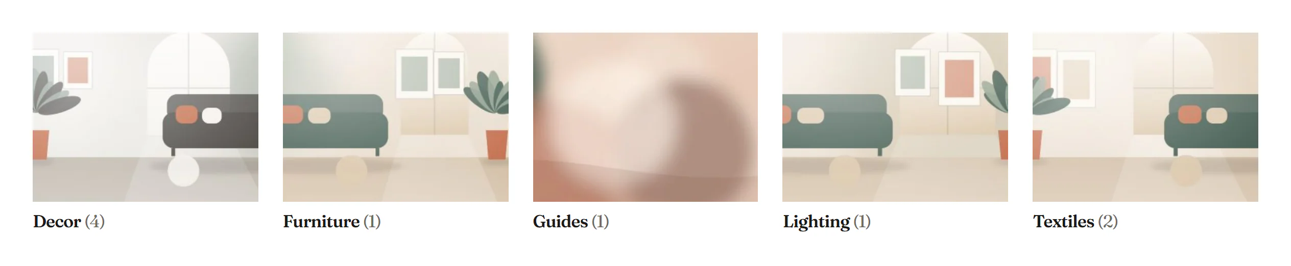
Choose which categories to show
| Show | Categories |
|---|---|
| Top-level categories (default) | The categories that have no parent. |
| All categories | Every category, subcategories included. |
| Chosen categories | The Categories you pick. |
| Subcategories of the category viewed | On a product category page, the categories inside it. Use it in a Product archive template. The editor previews your top-level categories; on other pages it shows nothing. |
Set the category images and the custom order in Products → Categories in WordPress. When there are no categories to show, the editor shows No product categories to show here. and the live page shows nothing.
Add Product Categories
Click Insert in the rail on the left and find Product Categories in the WooCommerce group, or type "categories" in the search box. Drag it onto the canvas, or click it to add it next to the selected element. See Add elements.
Content tab settings
| Setting | What it does |
|---|---|
| Show | Top-level categories, All categories, Chosen categories or Subcategories of the category viewed. Default: Top-level categories. |
| Categories | The categories to show. For Chosen categories. |
| Number of categories | 1–100. Empty shows all. Not for Chosen categories. |
| Order | Name, Custom order, Number of products or Newest first. Default: Name. |
| Hide empty categories | Leaves out categories without products. On by default. |
| Number of products | Shows the number of products after the name. On by default. |
| Setting | What it does |
|---|---|
| Columns | 1–8. Empty: 4 on desktops, 3 on tablets, 2 on phones. Can differ per device. |
| Column gap, Row gap | Space between the cards. Can differ per device. |
| Alignment | Left, Center or Right for the card content. Can differ per device. |
Design tab settings
| Section | Settings |
|---|---|
| Card | Background, Padding, Border, Border radius and Shadow. |
| Image | Border radius, Shape (As uploaded, Square, Portrait 4:5, Landscape 4:3 or Wide 16:9) and Background. |
| Name | Typography, Color, Hover color and Count color (when Number of products is on). |
The Design tab also has the sections every element shares: Spacing & position, Background & border and Mask. See Spacing, size & position.
Behaviour tab
The Behaviour tab has the settings every element shares: anchor and classes, entrance animations, motion effects, visibility per device, display conditions and interactions. See Visibility.
Tips
- Give every category an image of the same shape, or set the Shape under Image, so the cards line up.
- To design category cards of your own, use a query loop container with Items: Terms and the Term dynamic tags.