Score Wheel
A wheel of life visitors score themselves, or a coloured wheel chart with before and after scores.
On this page
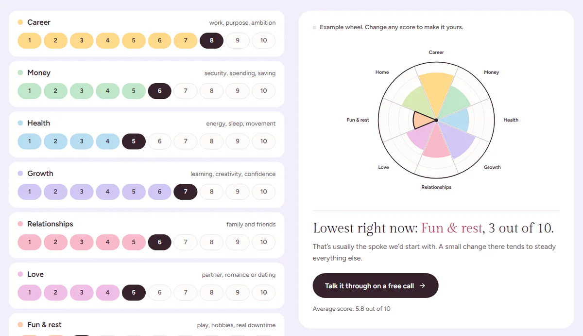
The Score Wheel widget draws a "wheel of life": a circle cut into areas such as career, health or home, each filled as far as its score. It has two forms:
- A check-in visitors fill in. A row of numbers for every area sits beside a card with the wheel. As visitors pick their scores, the wheel takes shape, and the card names their lowest area with a line of advice and a button, for example to book a call. Coaches, therapists, trainers and consultants use it to start a conversation.
- The wheel only (a chart). The wheel as a picture: a decoration, a client's result, or a before-and-after with the earlier scores drawn as a dashed outline.
Nothing a visitor scores is saved or sent anywhere. The check-in works in the visitor's browser only.
Add a Score Wheel
Click Insert in the rail on the left and find Score Wheel in the Marketing group, or type "wheel" in the search box. Drag it onto the canvas, or click it to add it next to the selected element. See Add elements.
A new Score Wheel comes with eight areas (Career, Money, Health, Growth, Relationships, Love, Fun & rest and Home), each with its own soft colour and an example score. Rename them, recolour them, or add and remove areas to fit your work.
Set up the areas
In Content → Wheel, each row of Areas is one wedge, clockwise from the top:
- Name and Hint: the area and a few words about it ("energy, sleep, movement"). The hint shows on the check-in rows.
- Color: the wedge, and on the check-in the numbers up to the score.
- Score: the example score the wheel starts with.
- Earlier score: a score from before, drawn as a dashed outline when Show earlier scores is on.
Three to twelve areas read best. Highest score sets the scale (10 by default).
Show a check-in
Choose Show → A check-in visitors fill in. Then write the card in Content → Check-in:
- Note over the wheel: a short line such as "Example wheel. Change any score to make it yours."
- Lowest area: the sentence that names the lowest area. {area}, {score} and {max} are filled in as visitors score, and the area's name takes the accent colour.
- Under the lowest area: one or two sentences of advice.
- Button text and Button link: where visitors go next, for example your booking page.
- Average: the average score under the button. Leave it empty to hide it.
On a computer the rows sit on the left and the card on the right, and the card stays in view while visitors scroll through the rows. On tablets and phones the two stack in one column: the wheel first, then the scores. To put the scores first, set When stacked to The scores, then the wheel.
Visitors can score with the mouse, a finger or the keyboard. Each row is a group of real radio buttons, so Tab moves between the areas and the arrow keys change the score. Screen readers hear "Score Career from 1 to 10" (change the words in Score buttons), and the wheel's description and the lowest area are read out as they change.
Show a chart
Choose Show → The wheel only (a chart) for a wheel without the rows and the card.
- Turn off Names around the wheel for a small or decorative wheel.
- Outline the lowest area draws a dark outline around the lowest wedge, as a pointer to "the spoke to start with", and shows that area's name around the wheel in the accent colour. On a check-in both follow the visitor's scores.
- Show earlier scores draws each area's Earlier score as a dashed outline, with a small legend under the wheel. Name the two in Earlier label and Now label ("Week 1" and "Week 12", say).
Name for screen readers is what the chart is called when it is read out ("Hannah's wheel of life"), followed by each area and its score. Hide a purely decorative wheel from screen readers with Behaviour → Attributes (aria-hidden|true).
Content tab settings
| Setting | What it does |
|---|---|
| Show | A check-in visitors fill in (the default) or The wheel only (a chart). |
| Areas | One wedge per area, clockwise from the top: Name, Hint, Color, Score and Earlier score. |
| Highest score | The top of the scale. Default: 10. |
| Names around the wheel | The area names outside the wheel. On by default. |
| Outline the lowest area | A dark outline around the lowest wedge, and its name in the accent colour. On by default. |
| Show earlier scores | Draws the earlier scores as a dashed outline, with a legend. Off by default. |
| Earlier label / Now label | The two legend words. Default: Before, Now. Shown with earlier scores. |
| Name for screen readers | What the wheel is called when it is read out. Default: Wheel of life. |
| Setting | What it does |
|---|---|
| Note over the wheel | A short line at the top of the card. |
| Lowest area | The sentence naming the lowest area; {area}, {score} and {max} are filled in. |
| Under the lowest area | The advice under it. |
| Button text / Button link | The card's button. Without a link the button is hidden. |
| Average | The average line under the button; {average} and {max} are filled in. Empty hides it. |
| Score buttons | What screen readers hear for each row of numbers. Default: Score {area} from 1 to {max}. |
| When stacked | On tablets and phones: The wheel, then the scores (the default) or The scores, then the wheel. |
Design tab settings
| Section | Settings |
|---|---|
| Wheel | Width (per device), Lines and names (the rim, spokes, centre, lowest outline and names), Wheel background (also the thin gap between the wedges), Rings, Names typography, Legend typography. |
| Score rows | Row background, Row corners, Space between rows, Area name, Hint and Numbers typography, Text color, Soft text color, Unscored numbers, Unscored border. Shown for a check-in. |
| Wheel card | Background, Padding, Corners, Note, Lowest area and Text under it typography, Lowest area name color, Button typography, Button text, Button background and Button hover. Shown for a check-in. |
The Design tab also has the sections every element shares: Spacing & position, Background & border and Mask. See Spacing, size & position.
Behaviour tab
The Behaviour tab has the settings every element shares: anchor and classes, entrance animations, motion effects, visibility per device, display conditions and interactions. See Motion & effects.
Tips
- Give the check-in section an anchor (for example
check-inin Behaviour → Anchor) and link to it from your hero: "Take the 60-second check-in". - Keep the example scores uneven, with one clearly lowest area, so the card has something to say before anyone scores.
- Use the same colours in the check-in and in charts elsewhere on the site, so visitors recognise the wheel.