Product Tabs
The product's description, additional information, reviews and extension tabs, as tabs or an accordion.
On this page
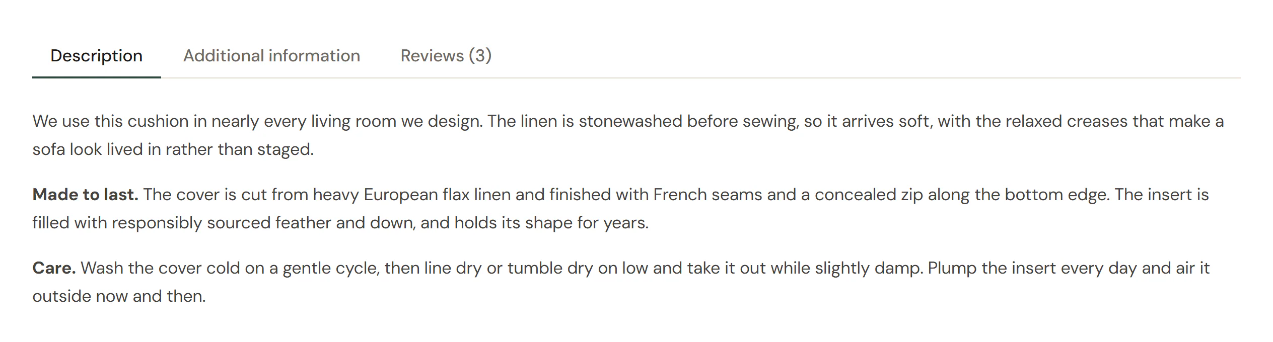
The Product Tabs widget shows WooCommerce's product tabs: Description, Additional information (attributes, weight and dimensions) and Reviews with the review form, plus any tab an extension adds, such as a size guide or FAQs. It uses the design of the Tabs widget, so you can show the tabs side by side, in a column, stacked or as an accordion, and choose a different layout per device. A new Product Tabs starts as an accordion on phones.
Where the product comes from
The widget shows the product being viewed: on a product page template it is the product the visitor opened. To show the tabs of one particular product anywhere else, pick it in the Product section of the Content tab.
A tab only appears when the product has something for it: Additional information needs attributes, a weight or dimensions, and Reviews needs reviews to be on for the product. The tab titles come from WooCommerce, such as "Reviews (3)", so you cannot edit them on the canvas. In the editor the review form is shown but cannot be sent.
When the product has nothing to show in tabs, the editor says so and the live page shows nothing.
Add Product Tabs
Open your product page template in the Theme Builder. Then click Insert in the rail on the left, find Product Tabs in the WooCommerce group (or type "reviews" in the search box) and drag it below the product summary. See Add elements.
Open the reviews from the rating
Deep linking is on by default. The "(3 customer reviews)" link of the Product Rating widget, and any other link to #reviews on the page, then opens the Reviews tab and scrolls to it. Keep it on when the template has a Product Rating.
Content tab settings
Settings marked Per device can differ on desktop, tablet and mobile (see Responsive editing).
| Setting | What it does |
|---|---|
| Initially open tab | Number of the tab that is open when the page loads (1 = the first tab). Default: 1. |
| Layout | Horizontal tabs above the content, Vertical tabs beside it, Stacked, above the content (the tabs one under another, above the panel) or Accordion. Default: Horizontal, and Accordion on mobile for a new widget. Per device. |
| Tabs position | Before the content or After the content. No effect in the Accordion layout. Default: Before the content. |
| Tabs alignment | Start, Center, End or Stretch. Per device. |
| Tab list width | Full width, or Hug the tabs at the start, centered or at the end: the list and its background are only as wide as the tabs. Not in the Vertical layout. Per device. |
| Title alignment | Aligns the text inside each tab: Left, Center or Right. Per device. |
| Accordion icon | Icon on the accordion headers. It turns upside down when the item is open. |
| Panel transition | None, Fade or Fade and slide up. Default: Fade. Visitors who prefer reduced motion get no animation. |
| Deep linking | Opens the Reviews tab from the rating's review link and from links to #reviews. On by default. |
| Accessible name | Optional name of the tab list for screen readers, for example "Product details". |
| Setting | What it does |
|---|---|
| Description | Shows the Description tab (the product's long description). On by default. |
| Additional information | Shows the Additional information tab (attributes, weight and dimensions). On by default. |
| Reviews | Shows the Reviews tab with the reviews and the review form. On by default. |
| Headings inside the panels | WooCommerce repeats "Description" and "Additional information" as a heading inside their panels. Off by default, since the tab already names the panel. |
Tabs added by extensions (size guides, FAQs…) appear too, as the note in this section says.
| Setting | What it does |
|---|---|
| Product | Leave empty to show the product being viewed (product pages). Pick a product to show it on any page. |
Design tab settings
| Section | Settings |
|---|---|
| Tabs | Typography, Space between tabs, Distance to content, Tab list width (Vertical layout), Padding and Border radius of the tabs; their Text color, Background, Border and Shadow on the Normal, Hover and Active tabs; the Active indicator (a line under the open tab) and the divider line; and the background, padding and radius of the whole Tab list. See Tabs for each setting. |
| Content | Background, Border, Border radius, Padding and Shadow of the panels. |
| Accordion layout | Space between items and Icon color, used where the layout is Accordion. The headers reuse the tab typography and colors. |
| Reviews | Text typography, Author color, Date color, Star color, Lines between reviews and Avatars (on by default; off hides the reviewers' pictures). |
The review form's fields and button follow your Design System. The Design tab also has the sections every element shares: Spacing & position, Background & border and Mask. See Spacing, size & position.
Behaviour tab
The Behaviour tab has the settings every element shares: anchor and classes, entrance animations, motion effects, visibility per device, display conditions and interactions. See Visibility.
Tips
- To show the description or the attributes as sections of their own, use Product Description or Additional Information and turn that tab off here.
- Set Layout to Accordion on mobile (a new widget already does): long tab rows do not fit on a phone.
- Shoppers see the open tab first. Keep Initially open tab on the description unless reviews matter most for your products.
- You can place two Product Tabs of the same product on one page, for example one for desktops and one for phones. The reviews and the review form then appear once, in whichever copy is on screen. A page showing the tabs of two different products keeps each product's review form separate.